
Trending colours to keep your new app design fresh
- By Eazi Business
- •
- 23 Apr, 2019
When you’re commissioning a brand new app to be built for your business, you’ll want to ensure that it looks modern, up-to-date and on trend. This means your choice of colour palette is incredibly important. Some of the colours you choose will be determined by your brand of course and you’ll certainly want your established business identity to shine through with the use of tones that reflect your company logo and business website.
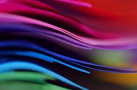
There will undoubtedly be the chance to use other colours however so, what shades should you be considering to give your new business app a thoroughly modern feel? Here’s our run-down of the colours trending right now (according to the experts at Pantone) for spring and summer 2019 to help your app stay on style.
Coral
Living Coral is PANTONE’s 2019 Colour Of The Year, following on from last year’s beautiful violet purple. This year’s selection is vibrant, with classy golden undertones and is said to energise and enliven. PANTONE says it’s also optimistic and joyful, modern yet in touch with nature and playful.
Blueberry
Colours this season are all about Mother Nature and blueberry is another top PANTONE pick, especially when paired with other shades of blue and yellow. Because of its deeper shade, this blue has a classic feel to it but it’s still slick and modern. It works best when paired with something lighter, such as a bold green or classic white.
Lime Zest
Zesty, vibrant lime is a playful choice and the perfect contrast to a darker palette if you want to add a cool, fresh pop of colour to your app design.
Ancient Grain
A not-quite sandy brown, this oatmeal or latte shade is muted but elegant. It’s a classic colour so it won’t soon start to look dated. As it’s a little paler, it’s also natural and sophisticated, perfect if your app relates to food, wellness, business or sustainability. It pairs well with whites and blues and can sit easily amongst two other colours without creating a visual mess.
Mango
With its sunshine hue and tropical allure, mango is another on-season and on-trend choice for any new app colour scheme. This shade is bright, fresh and modern – the exact shade of a perfectly ripe tropical fruit. As it’s a strong colour in its own right, it’s perfect for contrasting with more muted, darker shades such as classic white or black but it can also hold its own if you want to make a real splash with pink, purple or blue.